Admin Dashboard With Next.js, TypeScript & Shadcn/ui
Jun 02, 2024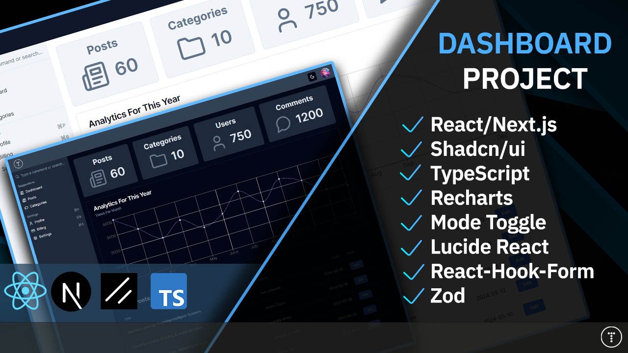
In this post, we will build an admin dashboard from scratch using Next.js, TypeScript, and Shadcn/ui, as well as some other packages. We are building the interface, so we won't be using any kind of database or ORM, however if you want to keep it going and add that yourself, you can. We'll just be using hardcoded data. In addition to TypeScript and Shadcn/ui, we will use tools like React-Hook Form and form validation with Zod. We'll integrate a library called Recharts to create a chart for analytics. We'll be using Lucide React for icons and the next-themes package to toggle light and dark modes.
Here is a screenshot of the dashboard home page:

This project will focus mostly on Shadcn-ui, a nontraditional component library. It doesn't even call itself a component library. It's a collection of reusable components. So, you get the code for a component and import that directly rather than an entire library.
You can copy and paste components from the website. You can also use npx and the CLI to bring the Shadcn component that you need into your project. This makes it easy to work with and allows you to access everything.
Shadcn/ui components are built on top of Radix UI and Tailwind CSS. Radix UI is a low-level component library that provides the building blocks for Shadcn/ui components. If you are reading this article, you know what Tailwind CSS is, but if not, it is a utility-first CSS framework that allows you to style your components using utility classes. Shadcn/ui components are styled with Tailwind. They are also designed to be accessible and work well with screen readers and keyboard navigation.
You can use Shadcn/ui with any framework that supports React, including React, Next.js, Gatsby, Astro, and Remix. Ports are even available for other frameworks, such as Vue.js. You can read more about that here. In this article, we'll set up a Next.js project and explore Shadcn/ui.
Let's start by setting up a Next.js project. We will use the create-next-app CLI to create a new project with Tailwind CSS support:
npx create-next-app@latest traversypress-dashboard --tailwind
You will be asked some questions. Here are the answers that I am going to select:
- Would you like to use TypeScript? Yes
- Would you like to use ESLint? No
- Would you like to use src/ directory for the source code? No
- Would you like to use App Router? Yes
- Customize default import alias: No
Then, it will set up a Next.js project.
Initializing Shadcn
We do need a bit of configuration, so we can run the following command to initialize Shadcn:
npx shadcn-ui@latest init
You will be asked which style. I will select "Default".
Then, it will ask for your base color. I will select the first option of Slate.
I will select yes for CSS variables.
This will create a few things. First, a file called components.json in the root of your project. This file is used to configure Shadcn. It has things like the location of your Tailwind config, if TypeScript is enabled, and the location of your CSS file. It just lets Shadcn know how your project is set up.
You only need this file if you are using the CLI. If you are just copying and pasting components from the website, you don't need this file.
I will also create a folder called lib with a utils.js, which is a utility function file. This file has a utility function called cn() that you can use to conditionally apply classes to your components. We will see how this is used later.
Next.js Cleanup
Let's clean up the Next.js project a bit. Open the app/page.tsx file and get rid of everything in the return, and add the following:
export default function Home( ) {
  return (
    <>
      <h1 className='text-2xl'>Dashboard</h1>
    </>
  );
}
Importing Components
So, let's say that we want to use the Button component. There are a few things that we can do. We can go to the Shadcn/ui website and copy the source code of the Button component and paste it into our project. If you go to the Components section, there is a CLI and Manual option. The CLI option will give you a command to run to bring the component into your project. The Manual option will give you the source code of the component that you can copy and paste into your project.

If you copy and paste, you do have to install the Radix UI dependency. You can do this by running the following command:
npm install @radix-ui/react-slot
We are going to use the CLI though. So let's run the following command to bring the Button component into our project:
npx shadcn-ui@latest add button
This will create a new button component in the components/ui directory. This button has everything that we need in terms of states, styling and accessibility. We can now use this button by importing it into the page.tsx file and using it like any other React component.
In the pages/index.tsx file, import the button component and use it like this:
import { Button } from '@/components/ui/button';

export default function Home( ) {
  return (
    <div>
      <Button>Click me</Button>
    </div>
  );
}
You can use different variants of the button component. For example, you can use the destructive variant like this:
<Button variant='destructive'>Click me</Button>
And it will make the button red. You can either look at the docs or just right inside of the button component to see all the available variants.
You can also use Tailwind classes to style the button. For example, you can use the bg-blue-500 class to make the button blue like this:
<Button className='bg-blue-500'>Click me</Button>
In most cases, you won't have to edit the actual components because they are fully customizable, but if you want to add another variant or something like that, you can.
You can remove the button stuff and just put the H1 back. I just wanted to show you how components are used.
Construct Top Navbar
We will create a navbar with a logo on the left and an avatar with a dropdown on the right. Create a new file at components/Navbar.tsx and add the following code:
'use client';

const Navbar = () => {
  return (
    <div className='bg-primary dark:bg-slate-700 py-2 px-5 flex justify-between'>
      Navbar
    </div>
  );
};

export default Navbar;
We are adding "use client" at the top. Client Components allow you to write interactive UI that is prerendered on the server and can use client JavaScript to run in the browser to be hydrated and provide interactivity. If you don't add this line, you'll get an error.
In your app/layout.tsx file, bring in the Navbar and add to the output:
import Navbar from '@/components/Navbar';

return (
  <html lang='en'>
    <body className={inter.className}>
      <Navbar />
      {children}
    </body>
  </html>
);
Logo
Let's add the logo. I am going to use the Traversy Media logo. We need to import the logo and Image component from Next and add it to the output. You can get the logo from the final code. Put it in a folder in the root called img and add the following:
import logo from '../img/logo.png';
import Image from 'next/image';
import Link from 'next/link';

const Navbar = () => {
  return (
    <div className='bg-primary dark:bg-slate-700 py-2 px-5 flex justify-between'>
      <Link href='/'>
        <Image src={logo} alt='' width={40} />
      </Link>
    </div>
  );
};
You should now see the logo.


Avatar Component
Shadcn has an Avatar component that we can use. You can install it with the following command:
npx shadcn-ui@latest add avatar
Now, in your Navbar, add the imports and use it:
import { Avatar, AvatarFallback, AvatarImage } from '@/components/ui/avatar';

const Navbar = () => {
  return (
    <div className='bg-primary dark:bg-slate-700 py-2 px-5 flex justify-between'>
      <Link href='/'>
        <Image src={logo} alt='' width={40} />
      </Link>
      <Avatar>
        <AvatarImage src='https://github.com/shadcn.png' alt='@shadcn' />
        <AvatarFallback>BT</AvatarFallback>
      </Avatar>
    </div>
  );
};
You can change the avatar image to whatever you want. The fallback letters will show if the image does not. I just used my initials.


Dropdown Menu Component
I want to be able to click the avatar and have a dropdown menu with profile and log out options. We need to install the dropdown component:
npx shadcn-ui@latest add dropdown-menu
We need to add the imports for the dropdown as well as the Link component:
import {
  DropdownMenu,
  DropdownMenuContent,
  DropdownMenuItem,
  DropdownMenuLabel,
  DropdownMenuSeparator,
  DropdownMenuTrigger,
} from '@/components/ui/dropdown-menu';
import Link from 'next/link';
Now add the following to the output:
const Navbar = () => {
  return (
    <div className='bg-primary dark:bg-slate-700 py-2 px-5 flex justify-between'>
      <Link href='/'>
        <Image src={logo} alt='' width={40} />
      </Link>
      <DropdownMenu>
        <DropdownMenuTrigger>
          {' '}
          <Avatar>
            <AvatarImage src='https://github.com/shadcn.png' alt='@shadcn' />
            <AvatarFallback>BT</AvatarFallback>
          </Avatar>
        </DropdownMenuTrigger>
        <DropdownMenuContent>
          <DropdownMenuLabel>My Account</DropdownMenuLabel>
          <DropdownMenuSeparator />
          <DropdownMenuItem>
            <Link href='/profile'>Profile</Link>
          </DropdownMenuItem>
          <DropdownMenuItem>
            {' '}
            <Link href='/login'>Logout</Link>
          </DropdownMenuItem>
        </DropdownMenuContent>
      </DropdownMenu>
    </div>
  );
};
Now you should see the dropdown when you click the avatar:


Sidebar
Now, let's create the sidebar component. Create a file at components/Sidebar.tsx and add the following:
const Sidebar = () => {
  return <div>Sidebar</div>;
};

export default Sidebar;
Import into your app/layout.tsx file and add the following to the layout output:
import Sidebar from '@/components/Sidebar';

return (
  <html lang='en'>
    <body className={inter.className}>
      <Navbar />
      <div className='flex'>
        <div className='hidden md:block h-[100vh]'>
          <Sidebar />
        </div>
        <div className='p-5 w-full md:max-w-[1140px]'>{children}</div>
      </div>
    </body>
  </html>
);
You should now see the sidebar.
Command Component
The command component is a fast, composable command menu and I think it looks great as a sidebar navigation. You can have links and a search box at the top to filter those links and items.
We are going to use icons from a package called Lucide React. We need to install that with NPM:
npm i lucide-react
Now in your sidebar, import the following icons and Command components as well as the Link component from Next:
import Link from 'next/link';
import {
  LayoutDashboard,
  Newspaper,
  Folders,
  CreditCard,
  Settings,
  User,
} from 'lucide-react';

import {
  Command,
  CommandEmpty,
  CommandGroup,
  CommandInput,
  CommandItem,
  CommandList,
  CommandSeparator,
  CommandShortcut,
} from '@/components/ui/command';
Now we will use the command components in the output:
const Sidebar = () => {
  return (
    <Command className='rounded-none bg-secondary'>
      <CommandInput placeholder='Type a command or search...' />
      <CommandList>
        <CommandEmpty>No results found.</CommandEmpty>
        <CommandGroup heading='Suggestions'>
          <CommandItem>
            <LayoutDashboard className='mr-2 h-4 w-4' />
            <Link href='/'>Dashboard</Link>
          </CommandItem>
          <CommandItem>
            <Newspaper className='mr-2 h-4 w-4' />
            <Link href='/posts'>Posts</Link>
          </CommandItem>
          <CommandItem>
            <Folders className='mr-2 h-4 w-4' />
            <Link href='/categories'>Categories</Link>
          </CommandItem>
        </CommandGroup>
        <CommandSeparator />
        <CommandGroup heading='Settings'>
          <CommandItem>
            <User className='mr-2 h-4 w-4' />
            <span>Profile</span>
            <CommandShortcut>⌘P</CommandShortcut>
          </CommandItem>
          <CommandItem>
            <CreditCard className='mr-2 h-4 w-4' />
            <span>Billing</span>
            <CommandShortcut>⌘B</CommandShortcut>
          </CommandItem>
          <CommandItem>
            <Settings className='mr-2 h-4 w-4' />
            <span>Settings</span>
            <CommandShortcut>⌘S</CommandShortcut>
          </CommandItem>
        </CommandGroup>
      </CommandList>
    </Command>
  );
};
This will give us the filter box and links/items with icons. We even have a component to show the keyboard shortcut.


Cards
Let's create our cards on the dashboard home page. We want four cards across the page to show the counts for posts, categories, users and comments. We are going to use the Card component from Shadcn-ui so we need to install it:
npx shadcn-ui@latest add card
Now let's create a component at components/dashboard/DashboardCard.tsx and add the following code:
import { Card, CardContent } from '@/components/ui/card';
import { Newspaper } from 'lucide-react';

const DashboardCard = () => {
  return (
    <Card className='bg-slate-100 p-4 pb-0'>
      <CardContent>
        <h3 className='text-3xl text-center mb-4 font-bold text-slate-500'>
          Posts
        </h3>
        <div className='flex gap-5 justify-center items-center'>
          <Newspaper size={72} className='text-slate-500' />
          <h3 className='text-5xl font-semibold text-slate-500'>120</h3>
        </div>
      </CardContent>
    </Card>
  );
};

export default DashboardCard;
Right now, we are hardcoding the content. Let's bring it to the homepage at app/page.tsx and embed it:
import DashboardCard from '@/components/dashboard/DashboardCard';

export default function Home( ) {
  return (
    <>
      <h1 className='text-2xl mb-4'>Dashboard</h1>
      <div className='flex justify-between gap-5 mb-5'>
        <DashboardCard />
      </div>
    </>
  );
}
Make The Card Dynamic
Now, let's make it dynamic. We want to pass 3 props, the title, count and icon:
import DashboardCard from '@/components/dashboard/DashboardCard';
import { Newspaper } from 'lucide-react';

export default function Home() {
  return (
    <>
      <h1 className='text-2xl mb-4'>Dashboard</h1>
      <div className='flex justify-between gap-5 mb-5'>
        <DashboardCard
          title='Posts'
          count={60}
          icon={<Newspaper size={72} className='text-slate-500' />}
        />
      </div>
    </>
  );
}
Now, let's refactor the DashboardCard component to accept and use these props:
import { Card, CardContent } from '@/components/ui/card';
import { LucideIcon } from 'lucide-react';

interface DashboardCardProps {
  title: string;
  count: number;
  icon: React.ReactElement<LucideIcon>;
}

const DashboardCard = ({ title, count, icon }: DashboardCardProps) => {
  return (
    <Card className='bg-slate-100 p-4 pb-0'>
      <CardContent>
        <h3 className='text-3xl text-center mb-4 font-bold text-slate-500'>
          {title}
        </h3>
        <div className='flex gap-5 justify-center items-center'>
          {icon}
          <h3 className='text-5xl font-semibold text-slate-500'>{count}</h3>
        </div>
      </CardContent>
    </Card>
  );
};

export default DashboardCard;
Now, we can add the other cards to the dashboard home page:
import DashboardCard from '@/components/dashboard/DashboardCard';
import { Newspaper, Folder, User, MessageCircle } from 'lucide-react';

export default function Home() {
  return (
    <>
      <h1 className='text-2xl mb-4'>Dashboard</h1>
      <div className='flex justify-between gap-5 mb-5'>
        <DashboardCard
          title='Posts'
          count={60}
          icon={<Newspaper size={72} className='text-slate-500' />}
        />
        <DashboardCard
          title='Categories'
          count={10}
          icon={<Folder size={72} className='text-slate-500' />}
        />
        <DashboardCard
          title='Users'
          count={750}
          icon={<User size={72} className='text-slate-500' />}
        />
        <DashboardCard
          title='Comments'
          count={1200}
          icon={<MessageCircle size={72} className='text-slate-500' />}
        />
      </div>
    </>
  );
}


Latest Posts Table
We are going to add the latest posts to the dashboard home. We will use the table component from Shadcn. As for the data, we will use hardcoded data in a file.
Let's create a file for the types/interfaces first. Create a file at types/post.ts and add the following:
export interface Post {
  id: string;
  title: string;
  body: string;
  author: string;
  date: string;
  comments: PostComment[];
}

export interface PostComment {
  id: string;
  text: string;
  username: string;
}
Now create a file at data/posts.ts and add the following:
import { Post } from '@/types/post';

const posts: Post[] = [
  {
    id: '1',
    title: 'The Rise of Artificial Intelligence',
    body: 'Artificial Intelligence (AI) is revolutionizing various industries...',
    author: 'John Doe',
    date: '2024-05-01',
    comments: [
      { id: '1', text: 'Great introduction!', username: 'Jane' },
      {
        id: '2',
        text: 'Looking forward to more posts on this topic.',
        username: 'Alex',
      },
    ],
  },
  {
    id: '2',
    title: 'Quantum Computing: A New Era of Computing',
    body: 'Quantum computing holds the potential to solve problems...',
    author: 'Emily Smith',
    date: '2024-04-28',
    comments: [
      { id: '1', text: 'Fascinating read!', username: 'Mark' },
      {
        id: '2',
        text: 'I have some questions about quantum algorithms.',
        username: 'Sarah',
      },
    ],
  },
  {
    id: '3',
    title: 'Blockchain: Transforming Industries',
    body: 'Blockchain technology is disrupting traditional industries...',
    author: 'David Johnson',
    date: '2024-05-03',
    comments: [
      { id: '1', text: 'Blockchain has immense potential!', username: 'Lucy' },
      {
        id: '2',
        text: "I'm curious about its scalability.",
        username: 'Michael',
      },
    ],
  },
  {
    id: '4',
    title: 'The Future of Augmented Reality',
    body: 'Augmented Reality (AR) is changing the way we interact...',
    author: 'Sophia Williams',
    date: '2024-05-05',
    comments: [
      { id: '1', text: 'AR applications are amazing!', username: 'Grace' },
      {
        id: '2',
        text: "Can't wait to see AR integrated into everyday life.",
        username: 'Jack',
      },
    ],
  },
  {
    id: '5',
    title: 'The Internet of Things (IoT): Connecting Everything',
    body: 'The Internet of Things (IoT) is creating interconnected...',
    author: 'Andrew Brown',
    date: '2024-05-08',
    comments: [
      {
        id: '1',
        text: 'IoT has huge potential for smart homes.',
        username: 'Olivia',
      },
      {
        id: '2',
        text: 'Security concerns need to be addressed.',
        username: 'William',
      },
    ],
  },
  {
    id: '6',
    title: '5G Technology: The Next Generation of Connectivity',
    body: '5G technology promises faster speeds and lower latency...',
    author: 'Emma Davis',
    date: '2024-05-10',
    comments: [
      {
        id: '1',
        text: 'Excited for the possibilities with 5G.',
        username: 'Sophie',
      },
      {
        id: '2',
        text: 'Hope it improves rural connectivity too.',
        username: 'Ethan',
      },
    ],
  },
  {
    id: '7',
    title: 'Cybersecurity in the Digital Age',
    body: 'As technology advances, cybersecurity becomes...',
    author: 'Michael Johnson',
    date: '2024-05-12',
    comments: [
      {
        id: '1',
        text: 'Cybersecurity is crucial for protecting data.',
        username: 'Ava',
      },
      { id: '2', text: 'Continuous monitoring is key.', username: 'Noah' },
    ],
  },
  {
    id: '8',
    title: 'Artificial Neural Networks: Mimicking the Brain',
    body: 'Artificial Neural Networks (ANNs) are inspired by the...',
    author: 'Isabella White',
    date: '2024-05-15',
    comments: [
      {
        id: '1',
        text: 'ANNs have applications in various fields.',
        username: 'Liam',
      },
      {
        id: '2',
        text: 'Training them requires a lot of data.',
        username: 'Mia',
      },
    ],
  },
  {
    id: '9',
    title: 'Cloud Computing: Enabling Scalable Solutions',
    body: 'Cloud computing provides on-demand access to computing...',
    author: 'James Taylor',
    date: '2024-05-18',
    comments: [
      {
        id: '1',
        text: 'Cloud computing has transformed IT.',
        username: 'Harper',
      },
      {
        id: '2',
        text: 'Concerned about data privacy in the cloud.',
        username: 'Logan',
      },
    ],
  },
  {
    id: '10',
    title: 'Machine Learning: Powering Intelligent Systems',
    body: 'Machine Learning (ML) algorithms enable computers...',
    author: 'Ava Johnson',
    date: '2024-05-20',
    comments: [
      { id: '1', text: 'ML is reshaping industries.', username: 'Emma' },
      {
        id: '2',
        text: "I'm interested in reinforcement learning.",
        username: 'Daniel',
      },
    ],
  },
];

export default posts;
Let's install the data table component from Shadcn:
npx shadcn-ui@latest add table
Create a component at components/PostsTable.tsx with the following code:
import {
  Table,
  TableBody,
  TableCaption,
  TableCell,
  TableHead,
  TableHeader,
  TableRow,
} from '@/components/ui/table';
import Link from 'next/link';
import posts from '@/data/posts';
import { Post } from '@/types/post';

interface PostsTableProps {
  limit?: number;
  title?: string;
}

const PostsTable = ({ limit, title }: { limit?: number; title?: string }) => {
  // Sort the posts array in descending order based on the date
  const sortedPosts: Post[] = [...posts].sort(
    (a, b) => new Date(b.date).getTime() - new Date(a.date).getTime()
  );

  // Filter the posts based on the limit prop
  const filteredPosts = limit ? sortedPosts.slice(0, limit) : sortedPosts;

  return (
    <div className='mt-10'>
      <h3 className='text-2xl mb-4 font-semibold'>{title ? title : 'Posts'}</h3>
      <Table>
        <TableCaption>A list of recent posts</TableCaption>
        <TableHeader>
          <TableRow>
            <TableHead>Title</TableHead>
            <TableHead className='hidden md:table-cell'>Author</TableHead>
            <TableHead className='text-right hidden md:table-cell'>
              Date
            </TableHead>
            <TableHead>View</TableHead>
          </TableRow>
        </TableHeader>
        <TableBody>
          {filteredPosts.map((post) => (
            <TableRow key={post.id}>
              <TableCell>{post.title}</TableCell>
              <TableCell className='hidden md:table-cell'>
                {post.author}
              </TableCell>
              <TableCell className='text-right hidden md:table-cell'>
                {post.date}
              </TableCell>
              <TableCell>
                <Link href={`/posts/edit/${post.id}`}>
                  <button className='bg-blue-500 hover:bg-blue-700 text-white font-bold py-2 px-4 rounded text-xs'>
                    Edit
                  </button>
                </Link>
              </TableCell>
            </TableRow>
          ))}
        </TableBody>
      </Table>
    </div>
  );
};

export default PostsTable;
We are creating a table with the post data. The component takes in a limit prop and we are passing in 5. If no limit is passed, then it will show all posts. It also takes in an optional title for the heading.
Now embed it on the homepage at app/page.tsx:
import PostsTable from '@/components/dashboard/PostsTable';

/...
 <DashboardCard
  title='Comments'
  count={1200}
  icon={<MessageCircle size={72} className='text-slate-500' />}
/>
</div>

<PostsTable limit={5} title='Latest Posts' /> /* Add this line */
Now you should see the latest posts on the dashboard.

 If you want to get rid of the caption at the bottom of the table, go to
 components/ui/table.tsx and comment out line 103:
const TableCaption = React.forwardRef<
  HTMLTableCaptionElement,
  React.HTMLAttributes<HTMLTableCaptionElement>
>(({ className, ...props }, ref) => (
  <caption
    ref={ref}
    className={cn('mt-4 text-sm text-slate-500 dark:text-slate-400', className)}
    // {...props} // Comment out this line
  />
));
TableCaption.displayName = 'TableCaption';
Analytics Chart
From what I can tell, Shadcn-ui does not provide any kind of charts or graphs, so we will be using a package called Recharts to add a line chart for views.
Install Recharts:
npm i recharts
First, we need the data. Let's add a new file in types/analytics.ts and add the following:
export interface AnalyticsItem {
  name: string;
  uv: number;
  pv: number;
  amt: number;
}
Then add the data file at data/analytics.ts:
import { AnalyticsItem } from '@/types/analytics';

const data: AnalyticsItem[] = [
  {
    name: 'Jan',
    uv: 4000,
    pv: 2400,
    amt: 2400,
  },
  {
    name: 'Feb',
    uv: 3000,
    pv: 1398,
    amt: 2210,
  },
  {
    name: 'Mar',
    uv: 2000,
    pv: 9800,
    amt: 2290,
  },
  {
    name: 'Apr',
    uv: 2780,
    pv: 3908,
    amt: 2000,
  },
  {
    name: 'May',
    uv: 1890,
    pv: 4800,
    amt: 2181,
  },
  {
    name: 'June',
    uv: 2390,
    pv: 3800,
    amt: 2500,
  },
  {
    name: 'July',
    uv: 3490,
    pv: 4300,
    amt: 2100,
  },
  {
    name: 'Aug',
    uv: 2400,
    pv: 2400,
    amt: 2400,
  },
  {
    name: 'Sep',
    uv: 3500,
    pv: 1300,
    amt: 2210,
  },
  {
    name: 'Oct',
    uv: 3000,
    pv: 9800,
    amt: 2290,
  },
  {
    name: 'Nov',
    uv: 2000,
    pv: 3908,
    amt: 2000,
  },
  {
    name: 'Dec',
    uv: 1890,
    pv: 4800,
    amt: 2181,
  },
];

export default data;
Now, let's add the component at components/AnalyticsChart.tsx:
'use client';

import {
  LineChart,
  Line,
  XAxis,
  YAxis,
  CartesianGrid,
  ResponsiveContainer,
} from 'recharts';
import {
  Card,
  CardContent,
  CardDescription,
  CardHeader,
  CardTitle,
} from '@/components/ui/card';

import data from '@/data/analytics';

const AnalyticsChart = () => {
  return (
    <>
      <Card>
        <CardHeader>
          <CardTitle>Analytics For This Year</CardTitle>
          <CardDescription>Views Per Month</CardDescription>
        </CardHeader>
        <CardContent>
          <div style={{ width: '100%', height: 300 }}>
            <ResponsiveContainer>
              <LineChart width={1100} height={300} data={data}>
                <Line type='monotone' dataKey='uv' stroke='#8884d8' />
                <CartesianGrid stroke='#ccc' />
                <XAxis dataKey='name' />
                <YAxis />
              </LineChart>
            </ResponsiveContainer>
          </div>
        </CardContent>
      </Card>
    </>
  );
};

export default AnalyticsChart;
We created a card with a line chart wrapped in a responsive container.


Posts Page
Let's create a new page at /posts. Create a file in app/posts.tsx and add the following:
import PostsTable from '@/components/PostsTable';

const PostsPage = () => {
  return (
    <>
      <PostsTable />
    </>
  );
};

export default PostsPage;
We are just re-using the PostsTable component.
BackButton Component
Let's create a component that will allow us to go back to the previous page. Create a file at components/BackButton.tsx and add the following:
import { ArrowLeftCircle } from 'lucide-react';

interface BackButtonProps {
  text: string;
  link: string;
}

const BackButton = ({ text, link }: BackButtonProps) => {
  return (
    <a
      href={link}
      className='text-gray-500 hover:underline flex items-center gap-1 font-bold mb-5'
    >
      <ArrowLeftCircle size={18} /> {text}
    </a>
  );
};

export default BackButton;
Now import it into the posts page and add it to the output:
import PostsTable from '@/components/PostsTable';
import BackButton from '@/components/BackButton';

const PostsPage = () => {
  return (
    <>
      <BackButton text='Go Back' link='/' />
      <PostsTable />
    </>
  );
};

export default PostsPage;
Pagination Component
Shadcn has a pagination component. Let's add that to the project:
npx shadcn-ui@latest add pagination
Now create a file at components/PostsPagination.tsx and add the following:
import {
  Pagination,
  PaginationContent,
  PaginationEllipsis,
  PaginationItem,
  PaginationLink,
  PaginationNext,
  PaginationPrevious,
} from '@/components/ui/pagination';

const PostsPagination = () => {
  return (
    <Pagination>
      <PaginationContent>
        <PaginationItem>
          <PaginationPrevious href='#' />
        </PaginationItem>
        <PaginationItem>
          <PaginationLink href='#'>1</PaginationLink>
        </PaginationItem>
        <PaginationItem>
          <PaginationLink href='#'>2</PaginationLink>
        </PaginationItem>
        <PaginationItem>
          <PaginationLink href='#'>3</PaginationLink>
        </PaginationItem>
        <PaginationItem>
          <PaginationEllipsis />
        </PaginationItem>
        <PaginationItem>
          <PaginationNext href='#' />
        </PaginationItem>
      </PaginationContent>
    </Pagination>
  );
};

export default PostsPagination;
Import the PostsPagination component into the app/posts.tsx page right under the PostsTable component:
const PostsPage = () => {
  return (
    <div>
      <PostsTable />
      <PostsPagination />
    </div>
  );
};
This is not going to be working pagination, it is just the UI.
Post Edit Form
Now, let's make it so that when we click the edit button, it goes to an edit form. Shadcn-ui uses React-Hook-Form and Zod for form validation.
Create the file app/posts/edit/[id]/page.tsx and add the following:
import BackButton from '@/components/BackButton';

const PostEditPage = () => {
  return (
    <>
      {' '}
      <BackButton text='Back to Posts' link='/posts' />
      Edit page
    </>
  );
};

export default PostEditPage;
Now, when you click the edit button, it should go to that page and form.
Create Form
We need to install a few components for the form. Let's install the form, input and textarea components:
npx shadcn-ui@latest add form
npx shadcn-ui@latest add input
npx shadcn-ui@latest add textarea
Now, let's add the form to the edit page:
'use client';

import * as z from 'zod';
import { useForm } from 'react-hook-form';
import { zodResolver } from '@hookform/resolvers/zod';
import {
  Form,
  FormControl,
  FormField,
  FormItem,
  FormLabel,
  FormMessage,
} from '@/components/ui/form';
import BackButton from '@/components/BackButton';
import { Input } from '@/components/ui/input';
import { Textarea } from '@/components/ui/textarea';
import { Button } from '@/components/ui/button';
import posts from '@/data/posts';

const formSchema = z.object({
  title: z.string().min(1, {
    message: 'Title is required',
  }),
  body: z.string().min(1, {
    message: 'Body is required',
  }),
  author: z.string().min(1, {
    message: 'Author is required',
  }),
  date: z.string().min(1, {
    message: 'Date is required',
  }),
});

interface PostEditPageProps {
  params: {
    id: string;
  };
}

const PostEditPage = ({ params }: PostEditPageProps) => {
  const post = posts.find((post) => post.id === params.id);

  const form = useForm<z.infer<typeof formSchema>>({
    resolver: zodResolver(formSchema),
    defaultValues: {
      title: post?.title || '',
      body: post?.body || '',
      author: post?.author || '',
      date: post?.date || '',
    },
  });

  const handleSubmit = (data: z.infer<typeof formSchema>) => {
    console.log(data);
  };

  return (
    <>
      <BackButton text='Back to Posts' link='/posts' />
      <h3 className='text-2xl mb-4'>Edit Post</h3>
      <Form {...form}>
        <form onSubmit={form.handleSubmit(handleSubmit)} className='space-y-8'>
          <FormField
            control={form.control}
            name='title'
            render={({ field }) => (
              <FormItem>
                <FormLabel className='uppercase text-xs font-bold text-zinc-500 dark:text-secondary/70'>
                  Title
                </FormLabel>
                <FormControl>
                  <Input
                    className='bg-slate-100 border-0 focus-visible:ring-0 text-black focus-visible:ring-offset-0'
                    placeholder='Enter title'
                    {...field}
                  />
                </FormControl>
                <FormMessage />
              </FormItem>
            )}
          />

          <FormField
            control={form.control}
            name='body'
            render={({ field }) => (
              <FormItem>
                <FormLabel className='uppercase text-xs font-bold text-zinc-500 dark:text-secondary/70'>
                  Body
                </FormLabel>
                <FormControl>
                  <Textarea
                    className='bg-slate-100 border-0 focus-visible:ring-0 text-black focus-visible:ring-offset-0'
                    placeholder='Enter body content'
                    {...field}
                  />
                </FormControl>
                <FormMessage />
              </FormItem>
            )}
          />

          <FormField
            control={form.control}
            name='author'
            render={({ field }) => (
              <FormItem>
                <FormLabel className='uppercase text-xs font-bold text-zinc-500 dark:text-secondary/70'>
                  Author
                </FormLabel>
                <FormControl>
                  <Input
                    className='bg-slate-100 border-0 focus-visible:ring-0 text-black focus-visible:ring-offset-0'
                    placeholder='Enter author'
                    {...field}
                  />
                </FormControl>
                <FormMessage />
              </FormItem>
            )}
          />

          <FormField
            control={form.control}
            name='date'
            render={({ field }) => (
              <FormItem>
                <FormLabel className='uppercase text-xs font-bold text-zinc-500 dark:text-secondary/70'>
                  Date
                </FormLabel>
                <FormControl>
                  <Input
                    className='bg-slate-100 border-0 focus-visible:ring-0 text-black focus-visible:ring-offset-0'
                    placeholder='Enter date'
                    {...field}
                  />
                </FormControl>
                <FormMessage />
              </FormItem>
            )}
          />

          <Button className='w-full'>Update Post</Button>
        </form>
      </Form>
    </>
  );
};

export default PostEditPage;
We pulled in the post data based on the id from the URL and added the default values to the form. We are using the form components from Shadcn-ui and React-Hook-Form with Zod for validation. We simply log the form data as we do not have a backend to update the post. Validation is working. If you try to submit the form without filling in the fields, you will see the error messages.
Toast Component
Shadcn-ui has a toast component that we can use to show messages to the user. Let's install it:
npx shadcn-ui@latest add toast
We need to have an output. This is the <Toaster /> component. We can add it to the layout file at app/layout.tsx:
//..other imports
import { Toaster } from '@/components/ui/toaster';

export default function RootLayout({
  children,
}: Readonly<{
  children: React.ReactNode;
}>) {
  return (
    <html lang='en'>
      <body className={inter.className}>
        <Navbar />
        <div className='flex'>
          <div className='hidden md:block h-[100vh]'>
            <Sidebar />
          </div>
          <div className='p-5 w-full md:max-w-[1140px]'>{children}</div>
        </div>
        <Toaster /> /* Add this line */
      </body>
    </html>
  );
}
Now, in the PostEditPage component, we can import the useToast hook and use it to show a message when the form is submitted:
import { useToast } from '@/components/ui/use-toast';
const handleSubmit = (data: z.infer<typeof formSchema>) => {
  toast({
    title: 'Post has been updated successfully',
    description: `Updated by ${post?.author} on ${post?.date}`,
  });
};
Now, when you submit the form, you should see the toast message.


Theme Toggler
I want to be able to toggle the theme from light and dark. We can do this with the help of a package called next-themes. Let's install that:
npm i next-themes
Now we need to setup the theme provider. Create a file at components/providers/ThemeProvider.tsx and add the following:
'use client';

import { ThemeProvider as NextThemesProvider } from 'next-themes';
import { type ThemeProviderProps } from 'next-themes/dist/types';

export function ThemeProvider({ children, ...props }: ThemeProviderProps) {
  return <NextThemesProvider {...props}>{children}</NextThemesProvider>;
}
Now, bring it into the layout at app/layout.tsx:
import { ThemeProvider } from '@/components/providers/ThemeProvider';
Wrap the app:
return (
  <html lang='en'>
    <body className={inter.className}>
      <ThemeProvider
        attribute='class'
        defaultTheme='light'
        enableSystem={true}
        storageKey='dashboard-theme'
      >
        <Navbar />
        <div className='flex'>
          <div className='hidden md:block h-[100vh]'>
            <Sidebar />
          </div>
          <div className='p-5 w-full md:max-w-[1140px]'>{children}</div>
        </div>
        <Toaster />
      </ThemeProvider>
    </body>
  </html>
);
Theme Toggler
Now let's create a file at components/ThemeToggler.tsx and add the following:
'use client';
import { Moon, Sun } from 'lucide-react';
import { useTheme } from 'next-themes';

import { Button } from '@/components/ui/button';
import {
  DropdownMenu,
  DropdownMenuContent,
  DropdownMenuItem,
  DropdownMenuTrigger,
} from '@/components/ui/dropdown-menu';

function ThemeToggler() {
  const { setTheme } = useTheme();

  return (
    <DropdownMenu>
      <DropdownMenuTrigger asChild>
        <Button
          className='bg-slate-700 hover:bg-slate-700 border-0 mr-5 p-2'
          variant='outline'
          size={null}
        >
          <Sun className='text-white h-[1.2rem] w-[1.2rem] rotate-0 scale-100 transition-all dark:-rotate-90 dark:scale-0' />
          <Moon className='text-white absolute h-[1.2rem] w-[1.2rem] rotate-90 scale-0 transition-all dark:rotate-0 dark:scale-100' />
          <span className='sr-only'>Toggle theme</span>
        </Button>
      </DropdownMenuTrigger>
      <DropdownMenuContent align='end'>
        <DropdownMenuItem onClick={() => setTheme('light')}>
          Light
        </DropdownMenuItem>
        <DropdownMenuItem onClick={() => setTheme('dark')}>
          Dark
        </DropdownMenuItem>
        <DropdownMenuItem onClick={() => setTheme('system')}>
          System
        </DropdownMenuItem>
      </DropdownMenuContent>
    </DropdownMenu>
  );
}

export default ThemeToggler;
Now we need to add it to the navbar. Open components/Navbar.tsx and import it and then add it to the output:
import ThemeToggler from './ThemeToggler';

return (
  <div className='bg-primary dark:bg-slate-700 py-2 px-5 flex justify-between'>
    <Link href='/'>
      <Image src={logo} alt='' width={40} />
    </Link>
    <div className='flex items-center'>
      <ThemeToggler />
      <DropdownMenu>
        <DropdownMenuTrigger>
          {' '}
          <Avatar>
            <AvatarImage src='https://github.com/shadcn.png' alt='@shadcn' />
            <AvatarFallback>CN</AvatarFallback>
          </Avatar>
        </DropdownMenuTrigger>
        <DropdownMenuContent>
          <DropdownMenuLabel>My Account</DropdownMenuLabel>
          <DropdownMenuSeparator />
          <DropdownMenuItem>
            <Link href='/profile'>Profile</Link>
          </DropdownMenuItem>
          <DropdownMenuItem>
            {' '}
            <Link href='/auth'>Logout</Link>
          </DropdownMenuItem>
        </DropdownMenuContent>
      </DropdownMenu>
    </div>
  </div>
);
Now you should be able to toggler from light to dark.
Main Layout
I want to start working on the login/register forms but need to have a separate layout for this because we don't wa nt the navbar or sidebar on the auth pages. The problem we have now is that the root layout at app/layout.tsx will wrap everything including any sub layouts we create.We can solve this by having a main layout and an auth layout and move the navbar and sidebar to the main layout.
Create a folder at app/(main) and move the homepage (app/page.tsx) to that folder. Folders with parenthesis do not affect the routing structure. They are just to categorize. So the home route will be unchanged.
Now, create a file at (main)/layout.tsx and add the following:
import Navbar from '@/components/Navbar';
import Sidebar from '@/components/Sidebar';

const MainLayout = ({ children }: { children: React.ReactNode }) => {
  return (
    <>
      <Navbar />
      <div className='flex'>
        <div className='hidden md:block h-[100vh]'>
          <Sidebar />
        </div>
        <div className='p-5 w-full md:max-w-[1140px]'>{children}</div>
      </div>
    </>
  );
};

export default MainLayout;
We are using the nav and sidebar here, so now we can remove them from the root layout. Open app/layout.tsx and make it look like this:
import type { Metadata } from 'next';
import { Inter } from 'next/font/google';
import './globals.css';
import { Toaster } from '@/components/ui/toaster';
import { ThemeProvider } from '@/components/providers/ThemeProvider';

const inter = Inter({ subsets: ['latin'] });

export const metadata: Metadata = {
  title: 'TraversyPress',
  description: 'Blogging platform for developers',
};

export default function RootLayout({
  children,
}: Readonly<{
  children: React.ReactNode;
}>) {
  return (
    <html lang='en'>
      <body className={inter.className}>
        <ThemeProvider
          attribute='class'
          defaultTheme='light'
          enableSystem={false}
          storageKey='dashboard-theme'
        >
          {children}
          <Toaster />
        </ThemeProvider>
      </body>
    </html>
  );
}
We removed the nav and sidebar components.
Auth Layout
We need to create the layout for the auth page. Let's create a file at app/(auth)/layout.tsx and add the following:
import ThemeToggler from '@/components/ThemeToggler';

const AuthLayout = ({ children }: { children: React.ReactNode }) => {
  return (
    <div className='h-[100vh] flex items-center justify-center relative'>
      <div className='absolute bottom-5 right-0'>
        <ThemeToggler />
      </div>
      {children}
    </div>
  );
};

export default AuthLayout;
This is a layout with no navbar/sidebar and the content is placed in the middle. We are also using the theme toggler component and positioning it to the bottom right corner.
Auth Page
Create a file at app/(auth)/auth/page.tsx and add the following:
import AuthTabs from '@/components/auth/AuthTabs';

export function AuthPage( ) {
  return (
    <>
      <AuthTabs />
    </>
  );
}

export default AuthPage;
We are just showing a component called AuthTabs that we have not created yet. Let's create a file at components/auth/AuthTabs.tsx and just add this for now:
const AuthTabs = () => {
  return <>Auth</>;
};

export default AuthTabs;
Now you should just see the text.
Tabs Component
We are going to use the Shadcn tabs component. Let's install it:
npx shadcn-ui@latest add tabs
Now, add the following to the AuthTabs.tsx file:
import { Tabs, TabsContent, TabsList, TabsTrigger } from '@/components/ui/tabs';

const AuthTabs = () => {
  return (
    <Tabs defaultValue='login' className='w-[400px]'>
      <TabsList className='grid w-full grid-cols-2'>
        <TabsTrigger value='login'>Login</TabsTrigger>
        <TabsTrigger value='register'>Create Account</TabsTrigger>
      </TabsList>
      <TabsContent value='login'>LOGIN FORM</TabsContent>
      <TabsContent value='register'>REGISTER FORM</TabsContent>
    </Tabs>
  );
};

export default AuthTabs;
You will now have tabs to switch from login to register. Let's replace the text with actual forms.
Login Form
Create a file at components/auth/LoginForm.tsx and add the following:
'use client';

import * as z from 'zod';
import { useForm } from 'react-hook-form';
import { zodResolver } from '@hookform/resolvers/zod';
import { Button } from '@/components/ui/button';
import {
  Card,
  CardContent,
  CardDescription,
  CardHeader,
  CardTitle,
} from '@/components/ui/card';
import { Input } from '@/components/ui/input';
import {
  Form,
  FormControl,
  FormField,
  FormItem,
  FormLabel,
  FormMessage,
} from '@/components/ui/form';
import { useRouter } from 'next/navigation';

const formSchema = z.object({
  email: z
    .string()
    .email({
      message: 'Invalid email',
    })
    .min(1, {
      message: 'Email is required',
    }),
  password: z.string().min(1, {
    message: 'Password is required',
  }),
});

const LoginForm = () => {
  const router = useRouter();

  const form = useForm<z.infer<typeof formSchema>>({
    resolver: zodResolver(formSchema),
    defaultValues: {
      email: '',
      password: '',
    },
  });

  const handleSubmit = (data: z.infer<typeof formSchema>) => {
    router.push('/'); // Navigate to the new post page
  };

  return (
    <Card>
      <CardHeader>
        <CardTitle>Login</CardTitle>
        <CardDescription>
          Log into your account with your credentials
        </CardDescription>
      </CardHeader>
      <CardContent className='space-y-2'>
        <Form {...form}>
          <form
            onSubmit={form.handleSubmit(handleSubmit)}
            className='space-y-6'
          >
            <FormField
              control={form.control}
              name='email'
              render={({ field }) => (
                <FormItem>
                  <FormLabel className='uppercase text-xs font-bold text-zinc-500 dark:text-white'>
                    Email
                  </FormLabel>
                  <FormControl>
                    <Input
                      className='bg-slate-100 dark:bg-slate-300 border-0 focus-visible:ring-0 text-black focus-visible:ring-offset-0'
                      placeholder='Enter email'
                      {...field}
                    />
                  </FormControl>
                  <FormMessage />
                </FormItem>
              )}
            />

            <FormField
              control={form.control}
              name='password'
              render={({ field }) => (
                <FormItem>
                  <FormLabel className='uppercase text-xs font-bold text-zinc-500 dark:text-white'>
                    Password
                  </FormLabel>
                  <FormControl>
                    <Input
                      type='password'
                      className='bg-slate-100 dark:bg-slate-300 border-0 focus-visible:ring-0 text-black focus-visible:ring-offset-0'
                      placeholder='Enter password'
                      {...field}
                    />
                  </FormControl>
                  <FormMessage />
                </FormItem>
              )}
            />

            <Button className='w-full'>Sign In</Button>
          </form>
        </Form>
      </CardContent>
    </Card>
  );
};

export default LoginForm;
Register Form
Now create the components/auth/RegisterForm.tsx component and add the following:
'use client';

import * as z from 'zod';
import { useForm } from 'react-hook-form';
import { zodResolver } from '@hookform/resolvers/zod';
import { Button } from '@/components/ui/button';
import {
  Card,
  CardContent,
  CardDescription,
  CardHeader,
  CardTitle,
} from '@/components/ui/card';
import { Input } from '@/components/ui/input';
import {
  Form,
  FormControl,
  FormField,
  FormItem,
  FormLabel,
  FormMessage,
} from '@/components/ui/form';
import { useRouter } from 'next/navigation';

const formSchema = z.object({
  name: z.string().min(1, {
    message: 'Name is required',
  }),
  email: z
    .string()
    .email({
      message: 'Invalid email',
    })
    .min(1, {
      message: 'Email is required',
    }),
  password: z.string().min(1, {
    message: 'Password is required',
  }),
  confirmPassword: z.string().min(1, {
    message: 'Confirm password is required',
  }),
});

const RegisterForm = () => {
  const router = useRouter();

  const form = useForm<z.infer<typeof formSchema>>({
    resolver: zodResolver(formSchema),
    defaultValues: {
      name: '',
      email: '',
      password: '',
      confirmPassword: '',
    },
  });

  const handleSubmit = (data: z.infer<typeof formSchema>) => {
    router.push('/'); // Navigate to the new post page
  };

  return (
    <Card>
      <CardHeader>
        <CardTitle>Register</CardTitle>
        <CardDescription>Sign up by adding the info below</CardDescription>
      </CardHeader>
      <CardContent className='space-y-2'>
        <Form {...form}>
          <form
            onSubmit={form.handleSubmit(handleSubmit)}
            className='space-y-6'
          >
            <FormField
              control={form.control}
              name='name'
              render={({ field }) => (
                <FormItem>
                  <FormLabel className='uppercase text-xs font-bold text-zinc-500 dark:text-white'>
                    Name
                  </FormLabel>
                  <FormControl>
                    <Input
                      className='bg-slate-100 dark:bg-slate-300 border-0 focus-visible:ring-0 text-black focus-visible:ring-offset-0'
                      placeholder='Enter name'
                      {...field}
                    />
                  </FormControl>
                  <FormMessage />
                </FormItem>
              )}
            />
            <FormField
              control={form.control}
              name='email'
              render={({ field }) => (
                <FormItem>
                  <FormLabel className='uppercase text-xs font-bold text-zinc-500 dark:text-white'>
                    Email
                  </FormLabel>
                  <FormControl>
                    <Input
                      className='bg-slate-100 dark:bg-slate-300 border-0 focus-visible:ring-0 text-black focus-visible:ring-offset-0'
                      placeholder='Enter email'
                      {...field}
                    />
                  </FormControl>
                  <FormMessage />
                </FormItem>
              )}
            />

            <FormField
              control={form.control}
              name='password'
              render={({ field }) => (
                <FormItem>
                  <FormLabel className='uppercase text-xs font-bold text-zinc-500 dark:text-white'>
                    Password
                  </FormLabel>
                  <FormControl>
                    <Input
                      type='password'
                      className='bg-slate-100 dark:bg-slate-300 border-0 focus-visible:ring-0 text-black focus-visible:ring-offset-0'
                      placeholder='Enter password'
                      {...field}
                    />
                  </FormControl>
                  <FormMessage />
                </FormItem>
              )}
            />

            <FormField
              control={form.control}
              name='confirmPassword'
              render={({ field }) => (
                <FormItem>
                  <FormLabel className='uppercase text-xs font-bold text-zinc-500 dark:text-white'>
                    Password
                  </FormLabel>
                  <FormControl>
                    <Input
                      type='password'
                      className='bg-slate-100 dark:bg-slate-300 border-0 focus-visible:ring-0 text-black focus-visible:ring-offset-0'
                      placeholder='Confirm password'
                      {...field}
                    />
                  </FormControl>
                  <FormMessage />
                </FormItem>
              )}
            />

            <Button className='w-full'>Sign Up</Button>
          </form>
        </Form>
      </CardContent>
    </Card>
  );
};

export default RegisterForm;
Now we can bring in the forms to the AuthTabs.tsx component:
import { Tabs, TabsContent, TabsList, TabsTrigger } from '@/components/ui/tabs';
import LoginForm from './LoginForm';
import RegisterForm from './RegisterForm';

const AuthTabs = () => {
  return (
    <Tabs defaultValue='login' className='w-[400px]'>
      <TabsList className='grid w-full grid-cols-2'>
        <TabsTrigger value='login'>Login</TabsTrigger>
        <TabsTrigger value='register'>Create Account</TabsTrigger>
      </TabsList>
      <TabsContent value='login'>
        <LoginForm />
      </TabsContent>
      <TabsContent value='register'>
        <RegisterForm />
      </TabsContent>
    </Tabs>
  );
};

export default AuthTabs;
You should now see the form.


That's it! We have created a pretty good-looking UI. Feel free to improve it. You can find the repo here.
Stay connected with news and updates!
Join our mailing list to receive the latest news and updates from our team.
Don't worry, your information will not be shared.
We hate SPAM. We will never sell your information, for any reason.
